Just in case you forget which city this is…
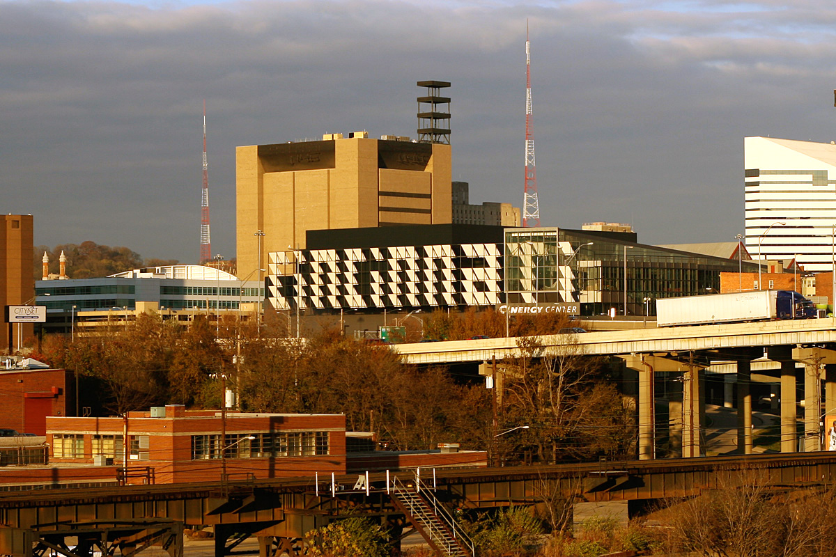
That building… to the left (zoom)… the one that spells out CINCINNATI in big letters made of angled panels… that’s the new expansion to our convention center.
That lettering is apparently a part of the final design, not just a happenstance temporary byproduct of construction scaffolding.
That’s not all. The color scheme of the Cinergy Center plays strongly on its Cincinnati home and includes clay or brick color to represent the soil along the Ohio River, which will progress into the indigos and blues and greens of the river along the main concourse. (source)
I suppose the saving grace here, is that there aren’t too many vantage points where you can see this eyesore. Though a passing comment made me realize, perhaps this is the new HOLLYWOOD of the midwest.
I try to hate little, but this sign I hate much.
I’m just waiting for jokes about Westsiders needing a reference for which city they are driving towards.
It needs to go.
Yeah, that’s pretty bad. Have you seen it when it’s lit up at night? *shudder*
The reasoning behind the color choices seem to make sense. I certainly think of bricks when I think of Cincy. Of course, you know I don’t live there anymore… well, I only lived there at 1 and 2 yrs old. *smile* But, it takes more than color choices to make something that an entire city can come behind and support (in terms of design).